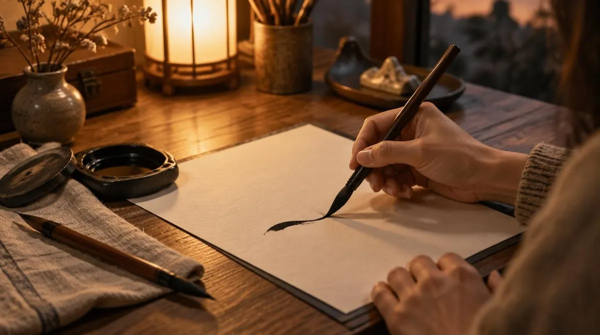
A good calligraphy tutorial needs one tool and one rule. The tool is a brush pen; the rule is thin upstrokes, thick downstrokes. Bring those two ideas together and graceful letters follow, with no drawer full of expensive kit.
What to look for in a first pen: a tip that is solid yet flexible, ink that flows clean and a body that sits comfortably in the hand. Budget matters less than repetition, as working letterers keep repeating. More hands-on guides live on our tutorials hub.
Which brush pen should a beginner pick?
Shelby Abrahamsen, who writes the lettering site Little Coffee Fox, sends newcomers towards two pens in particular: Tombow Dual Brush Pens and Faber-Castell PITT Artist Pens. Both carry nylon tips she describes as solid but flexible, giving plenty of control. For looser, more gestural lines she reaches for the Pentel Pocket Brush Pen and its rich black ink.
Her summary of the hobby is suitably light on shopping: it “requires only two things: a brush pen and some practice”. Over on the journal of the pen-maker Archer & Olive, guest artist Neus adds a reassuring note. A fine brush tip is often easier for a beginner to manage than a broad one, because the thinner point forgives a lighter hand.
How does pressure make lines thin and thick?
Neus sums the whole technique up in three words: “Thin up thick down.” Strokes travelling up the page take little pressure, so the flexible tip stays narrow. Strokes travelling down take more pressure, and the tip spreads. The pen sits at about 45 degrees in the hand, which is what turns extra weight into a wider line. For related coverage, see Screen printing at home needs only a screen, a squeegee and a kitchen table.
Abrahamsen’s version of the rule runs the same way: “apply light pressure on the pen every time you pull the pen up and apply heavier pressure every time it goes down”. Her grip advice is practical too. Holding the pen higher up than a usual ballpoint grip keeps the fingers from doing the drawing.
Pressure, not speed, does the shaping. Because the tip flexes, the same pen can whisper a hairline or swell to a full stroke, and the change happens the moment the hand leans in. Slow hands are welcome here.
Which drills build control fastest?
Drills come first, letters later. Abrahamsen expects to practise the same stroke many times before the hand settles. Her starting sequence is plain and repeatable.
- Rows of light upstrokes, then rows of heavy downstrokes, across the whole page.
- The two combined in one motion, rising and falling like a wave.
- Steady pressure through every downstroke, from start to finish, for an even line.
Neus recommends running each drill to the end of the paper, at least a couple of times, and plenty of every one of them. The page, in her plan, is the workbook. A stack of plain sheets and one pen make the whole classroom.
Neus has a kind word for wobbly lines: they are normal, and “everyone (EVERYONE) you see on social media has been there”. In her words, practice makes progress. Her guide even promises that the body “will thank you for keeping a good posture”, and it comes with a free lettering template for tracing.
When the rows look even, the same strokes begin to bend. Curves, ovals and loops join the repertory, and those curves are exactly what letterforms are built from. The alphabet, in other words, is already hiding in the drills.
Where does a warm wrist go next?
A steady hand transfers well to other crafts. Printmakers talk about pressure in the same breath: our step-by-step linocut printing guide shows how even force cuts a clean line into lino. Calligraphy and carving reward the same patient wrist.
Conclusion: one pen, one rule, one page at a time
Brush pen lettering asks for little and gives much. Pick one flexible pen, honour the thin-up-thick-down rule and let the drills do their slow work. The letters will follow the strokes, and the strokes will come whenever the pen does.