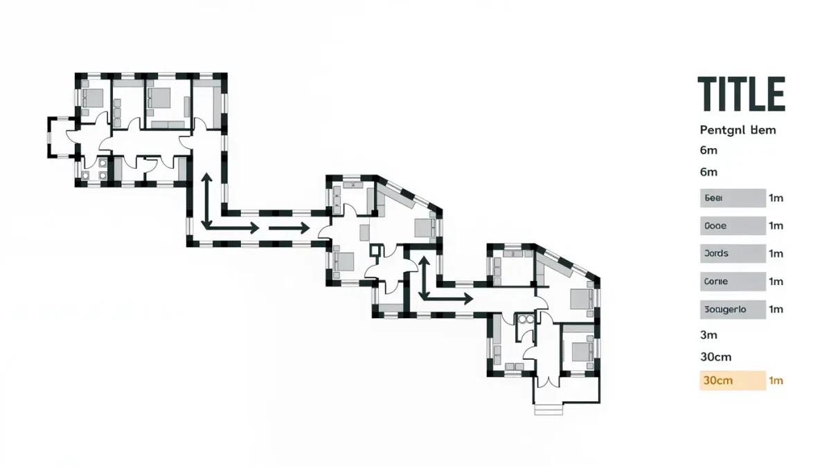
Exhibition graphics are everything designed around the objects: the title wall that names the show, the section panels that carry its argument, the small labels beside each vitrine, the arrows and floor guides that move visitors through the rooms. A major show can require hundreds of individual graphics, from lettering cut three metres high down to an object label of perhaps fifty words — and almost all of it is settled, printed and installed before the doors open.
What do exhibition graphics actually include?
The inventory is longer than most visitors realise. There are interpretive panels, which set out each section's story; object labels, the short texts that sit beside every display case; introductory and title graphics, often covering an entire wall; wayfinding, from ticket-queue signage to room numbers; vinyl wall text for quotations and timelines; cases of text printed directly onto plinths and glass; plus the supporting family of leaflets, large-print guides, audio-tour references and accessible routes. Together these form a second exhibition — an invisible one laid over the physical — and when it works, visitors feel guided without ever noticing they are being led.
Who makes them, and when does the work start?
A triangle of people: curators who own the content, an interpretive planner or interpretation team who shape what visitors need to know, in what order, and a graphic designer who turns that plan into physical space. Work typically begins a year or more before opening, sometimes several years for large blockbusters. The process runs from an interpretive plan — a document defining the show's big idea, its sections and the tone of voice — through design concepts, content drafts, typography and layouts, to a graphic panel schedule and finally production. Curators write; editors cut; designers measure; and every text passes through more rounds of correction than anyone enjoys counting.
How does typography carry a visitor through a show?
Through hierarchy — a system of sizes that tells the eye what to read from where. A title wall must work from ten metres; section headers from three; panel text from one; object labels from about sixty centimetres, often by a visitor leaning in with others waiting behind. Designers establish this ladder early and hold it ruthlessly, because a gallery that shouts everywhere communicates nothing. Sans-serif faces dominate wayfinding for good reason: open letterforms with generous x-heights stay legible at distance and at shallow angles. The lineage is proud — Adrian Frutiger designed his 1975 airport face for exactly this kind of glance-and-go reading — and museum designers still reach for similar anatomy when a family needs to guide a crowd at walking speed.
What is a graphic panel schedule?
The production bible. It is a spreadsheet listing every single graphic in the exhibition: its number, final approved text, dimensions, material, finish, location, installer and any special conditions. A show with 300 graphics has 300 rows, and a mistake in row 214 — a caption mismatched to an object, a panel sized for the wrong wall — is far cheaper to fix in the spreadsheet than on the gallery floor. The schedule is why exhibition graphics can be manufactured in the final months while everything else is still moving; it freezes the moving parts into one accountable list.
What materials survive gallery life?
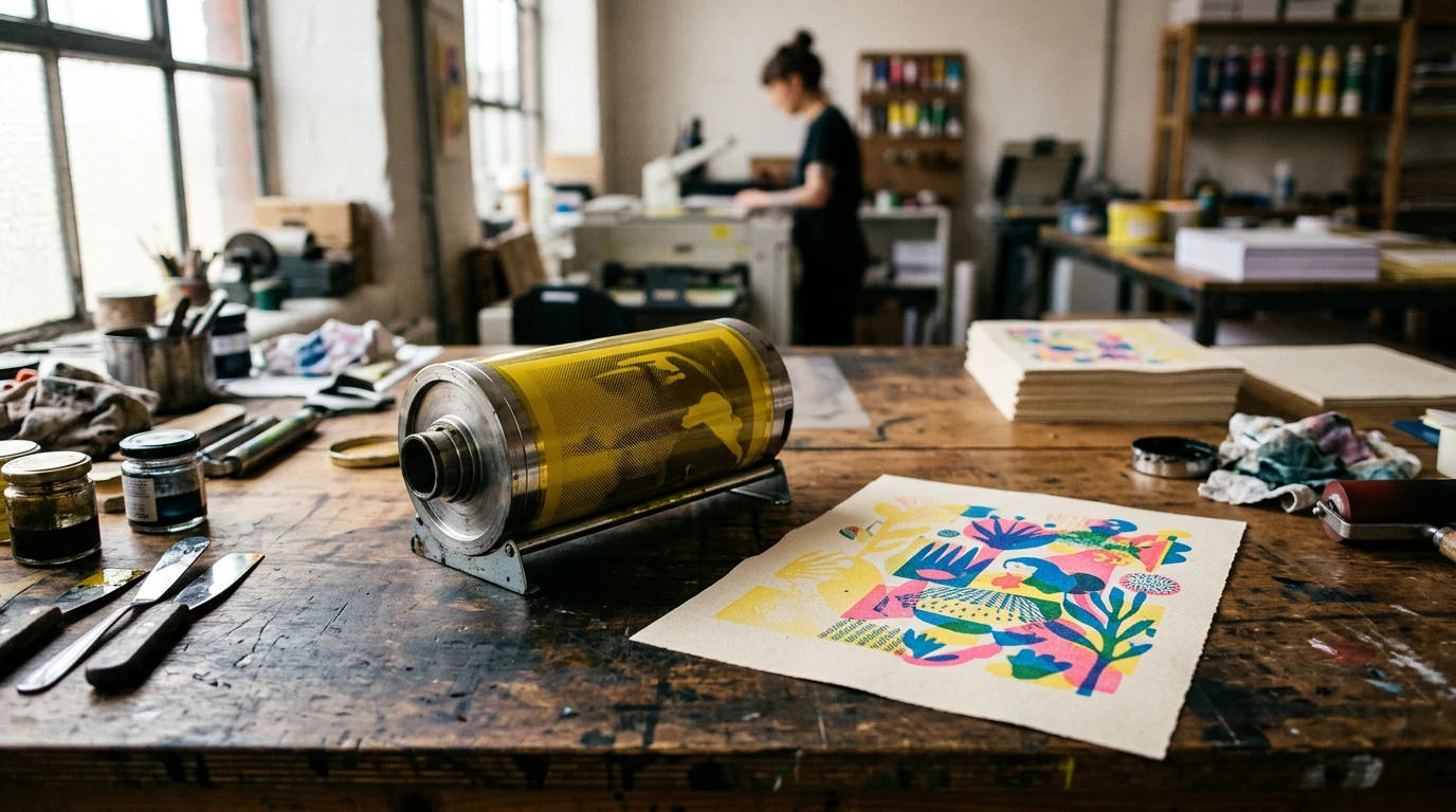
Graphics live a hard life in public buildings, so materials are chosen for durability, conservation and speed of install. Cut vinyl lettering applied directly to painted walls remains the workhorse — cheap, crisp, quick to remove at de-install. Rigid panels of aluminium composite or foam board carry photographic images and long texts; fabric graphics and printed scrims divide rooms; text can be screen-printed or applied to glass cases. Near sensitive objects, materials must also be chemically inert, since plinths, adhesives and paints can emit compounds that conservators spend their careers keeping away from textiles and works on paper. Nothing is chosen purely for looks; everything is chosen for a building that will be swept, bumped and re-lit every night for months.
How is accessibility designed in?
From the start, not at the end. That means text hung at heights workable for seated and standing visitors, contrast ratios strong enough for low vision, label text set large enough for its real reading distance, and careful placement so wheelchair users are not reading around standing shoulders. Many museums add large-print versions of every text, tactile or handled elements where objects can be reproduced, and family trails that layer a second, simpler voice over the main interpretation. The best shows treat accessibility as a design constraint that improves the result for everyone — clearer hierarchy, calmer walls, shorter sentences.
What happens at installation?
A compressed, dusty fortnight. Cases are built, walls painted, objects conditioned to the rooms, and then the graphics team works through the schedule row by row — vinyl applied with tape and patience, panels hung and levelled, every title checked against the catalogue one last time. The final act is the walk-through: designer, curator and editor move through the show at visitor pace, reading everything as if for the first time. Only when that reading flows does the show open. Reviews and visitor coverage — of the kind gathered by BBC Culture and its peers — may praise the objects, but the routes those writers followed, the panels that framed their thinking and the labels that told them what they were looking at were all designed, quietly, a year earlier.