Open any paperback and you are looking at a machine for reading. The block of text sits inside four margins sized to the page, the lines land on a fixed rhythm so the eye can jump accurately from one to the next, and the folio, the running heads and every chapter opening obey the same invisible grid. Between 1946 and 1949 the typographer Jan Tschichold rebuilt that grid for Penguin Books, and the paperback you are imagining now is largely his.
What is the grid on a book page?
A book page is a set of decisions pretending to be nothing at all. The text block — the rectangle the words occupy — is placed within the page by four margins: head, fore-edge, tail and the inner gutter where the binding gathers. Lines of text sit on a baseline grid, evenly spaced by the leading; folios and running heads take fixed positions in the margins; illustrations, tables and chapter openings snap to the same vertical rhythm. When a page looks calm, it is because hundreds of measurements agree with each other. Nothing about it is neutral: every white band is doing work, holding the book in the hand, sheltering the thumb, giving the eye somewhere to rest at each line's end.
Where do these proportions come from?
From scribes, and from their rediscovery in the twentieth century. Medieval manuscript pages were ruled with striking geometric care, and Renaissance printers inherited those habits. The famous historical canons — the Van de Graaf canon among them — construct a text block from diagonal lines drawn across a spread, yielding margins in which the inner is the narrowest, the outer wider for the thumb, and the tail the deepest of all. Jan Tschichold, who studied these constructions closely, found that pages laid out centuries apart obeyed nearly identical proportions. The lesson is consoling: the well-proportioned page is not a matter of taste but of geometry that has kept working since before printing existed.
What did Tschichold actually change at Penguin?
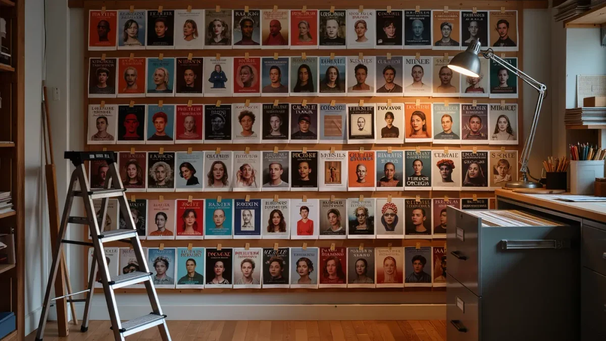
Consistency, at industrial scale. Penguin had been publishing since 1935, when Allen Lane's first ten paperbacks went on sale at sixpence each, but its pages were set by different printers to different rules. Tschichold arrived in 1946 and by 1947 had drawn up the Penguin Composition Rules: fixed type sizes and leadings, defined margins, disciplined punctuation, hyphenation and folio placement, applied across the entire list. A reader could move between a detective story and a piece of serious non-fiction and find the same comfortable page in both. It was one of the earliest and most complete applications of a design system in mass publishing, and it proved that good typography could be a standard rather than a luxury. For anyone wanting to trace the physical evidence, early printed books in the Library of Congress collections show five centuries of these grids, page by page.
What rules still govern a well-set page?
The classics have never been bettered. Margins mirror across the spread, with the gutter allowances shared between facing pages. Lines are kept to a comfortable measure — roughly sixty to seventy-five characters — because longer lines exhaust the eye's return trip and shorter ones chop the rhythm. Widows, a lone line stranded at the top of a page, and orphans, a first line abandoned at the bottom, are hunted down at proof stage. Hyphenation is limited, ragged edges are kept gently irregular, and punctuation hangs slightly into the margin so the edge looks optically straight. None of these rules is decorative; each one removes a small friction between the reader and the text.
How do designers check a grid in practice?
With folded proofs and a lamp. A signature is printed and folded exactly as it will be bound, then held up against a light so the type shows through from the page behind — instantly revealing whether the text block is centred on the spread or drifting, whether margins mirror, and where the grid has slipped. Designers also check a book at arm's length and at reading distance: the grid should be invisible up close and satisfying as a whole from afar. Tschichold himself was a famously unsentimental inspector of proofs; the stories of his red pencil are part of the trade's affectionate folklore, and the habit he modelled — measure everything, assume nothing — remains the whole method.
Does the fixed grid still matter in the e-book age?
Reflowable e-books abandon the fixed page altogether, letting text reflow to whatever screen and type size the reader chooses — a genuinely liberating change for accessibility. But the grid's logic has migrated rather than died. Fixed-layout editions, from art books to children's picture books, still need real page design; web typography has adopted the baseline grid wholesale; and print, far from disappearing, has absorbed the paperback's original lesson that a well-designed page can belong to everyone. The grid survives because it encodes something permanent: reading is a physical act, and the page is its instrument.
What should you notice next time you open a book?
Start with the margins — which is narrowest, and whether the deep one is at the foot. Look at a spread, not a page, and see how the two text blocks face each other. Check whether the folios and running heads sit in calm, repeatable positions. None of this will be credited anywhere in the book, which is exactly the point. A page designer's success is measured in hours of reading in which nobody once thinks about the page: the grid does its work, and disappears.