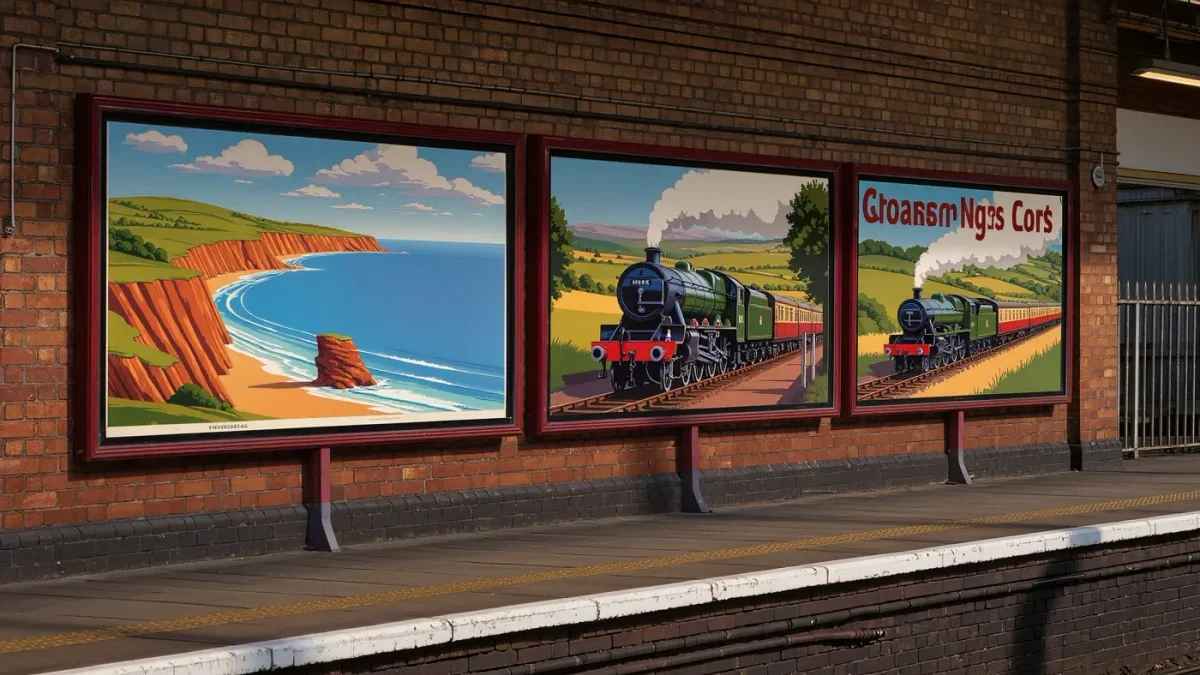
Between the grouping of 1923 and nationalisation at the start of 1948, Britain's four railway companies — the LMS, the LNER, the GWR and the Southern — commissioned thousands of posters from fine artists and commercial designers alike. Printed mainly in the standard double royal format of roughly 50 by 40 inches, they were engineered to sell a destination in the two or three seconds a passer-by might glance. That constraint produced one of the great bodies of graphic design, and it is still worth copying.
Why did the railways take art so seriously?
Competition forced taste. After 1923 the Big Four competed for the same passengers on routes that were often matched for speed and comfort, so image became the battleground — and the poster was the weapon. Each company cultivated a house style. The LNER built a clean, modern look under the guidance of its advertising manager William Teasdale, collecting artists rather than illustrators; the LMS ran open competitions that drew painters by the hundred; the GWR leaned on golden seaside light; the Southern made sport and sunshine its signature. The precedent came from London's underground, where Frank Pick had been commissioning fine artists for public transport since 1908 and had shown how far a consistent, high-quality poster programme could carry a brand.
Who made the classic posters?
An astonishing roll-call. Norman Wilkinson, a marine painter who also invented dazzle camouflage for warships in 1917, brought ocean-liner atmosphere to LNER routes. Tom Purvis reduced figures to flat, stylish silhouettes for the same company, stripping a scene down until it read at a hundred paces. The American-born Edward McKnight Kauffer, famous for his underground posters, contributed railway work of real elegance. Behind them stood an earlier generation: John Hassall's 1908 Jolly Fisherman, skipping along the sand for Skegness under the slogan of it being so bracing, had already proved that one memorable character could carry a resort for decades. Terence Cuneo later brought locomotive realism to a peak. Few industries anywhere have drawn on such talent so regularly.
What design rules do the posters teach?
The first lesson is scale: a railway poster carries one message, one mood and one destination name, set in lettering large enough to be read from a moving bus. The second is simplification — skies flatten into bands of colour, crowds become three figures, a coastline becomes one confident curve, because detail that survives in an oil painting dies on a hoarding. The third is the human figure at the right size: a small figure on a cliff gives the scene scale and the viewer a place to stand. The fourth is colour as emotion: warm light on a beach at dusk promising the exact feeling of being there. And the fifth is integration — lettering and image designed together, the destination name locked into the composition rather than pasted on. Every one of these rules transfers directly to any graphic that must work in seconds.
How did a poster campaign actually work?
Railway poster programmes ran like clockwork. Each company kept a roster of artists, briefed them on a destination or a service, and reviewed sketches before any printing went ahead; approved artwork passed to the lithographic printers, and finished posters were distributed to stations in seasonal waves — winter sports before Christmas, beaches from late spring. Designs were pasted into frames and hoardings across the whole network, so one image might appear simultaneously in Cornwall and Aberdeenshire. Companies reinforced the posters with leaflets, guidebooks and timetable inserts that repeated the same imagery, making each campaign an early example of what would now be called a coordinated identity: one image, many formats, one promise.
How were the posters printed?
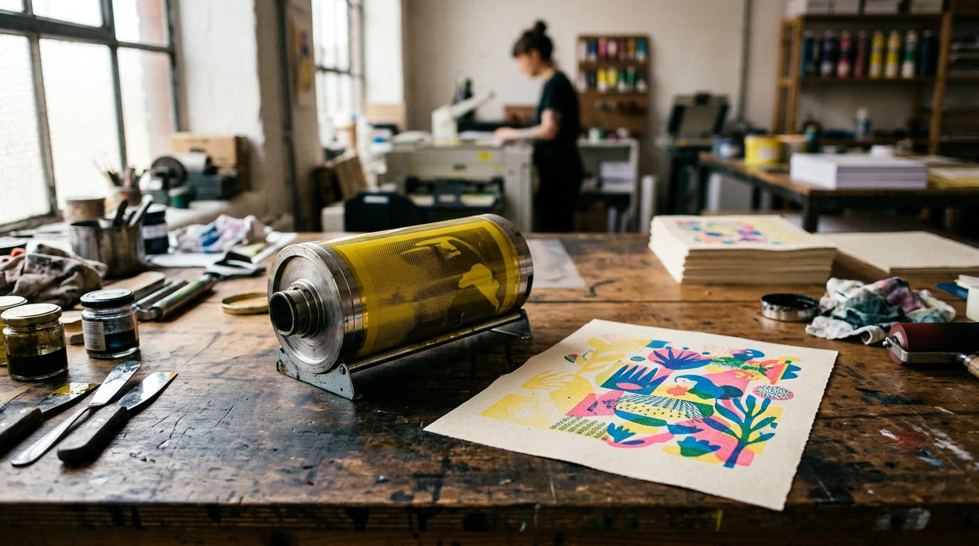
By lithography, in its stone and, later, offset forms, printed by specialist houses such as the Baynard Press in London. Lithography suited the posters perfectly: large sheets, flat brilliant colour, and an economy in which each additional colour meant an additional plate and pass, so artists learned to say more with fewer tints. The physical poster was designed for short life — pasted at stations, weathered, over-pasted — which is why fine surviving examples are treasured and command museum care today.
Where do the lessons apply now?
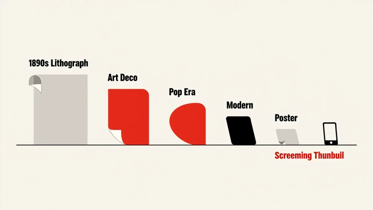
Anywhere attention is brief. A social feed thumbnail, a festival poster, a shop window seen from a bus and a web banner are all double royals in spirit, demanding one message at a glance. Design students are still set the railway brief — one destination, one image, three seconds — precisely because its constraints are so pure. Modern brand design has quietly reabsorbed the railway rules: flat colour, human scale, one promise per frame. The posters also remain a working lesson in art direction — proof that hiring fine artists to serve a commercial brief raises the brief rather than compromising the artist.
Where can you still see them?
The National Railway Museum in York holds one of the largest and most significant poster collections in the world, and original examples hang at heritage stations, in auctions and in travelling exhibitions; renewed public appetite for mid-century poster art has been followed for years by BBC Culture among other arts desks. Framed under glass in a station concourse, a 1930s poster still does exactly what it was made to do — stop a stranger mid-stride with the promise of somewhere better — which is the whole job of graphic design, achieved eighty years early.