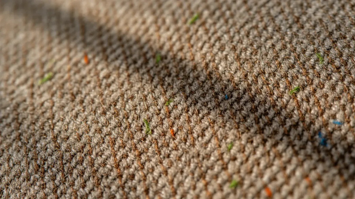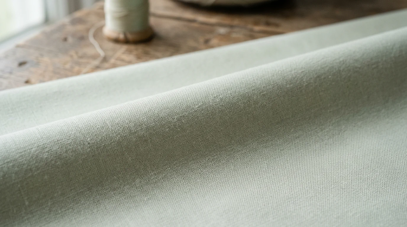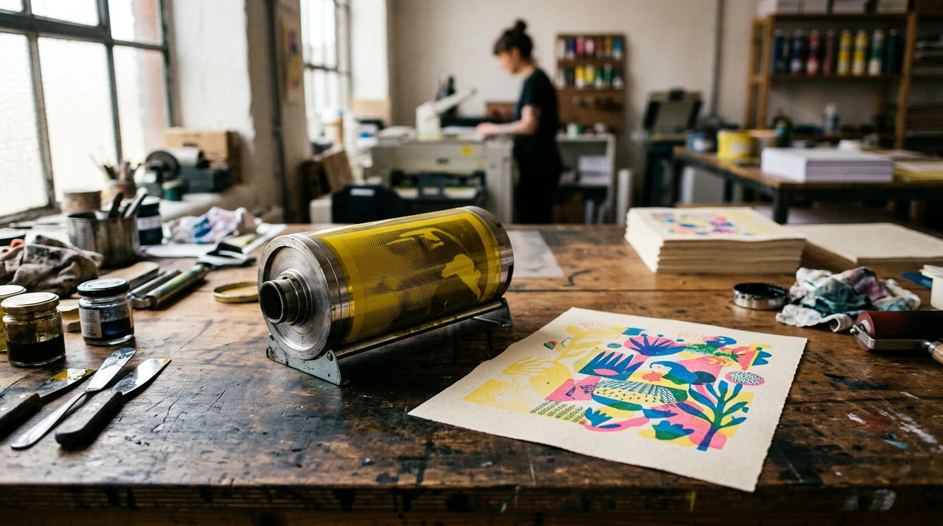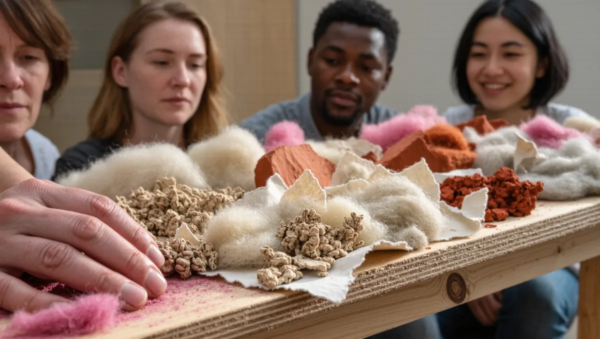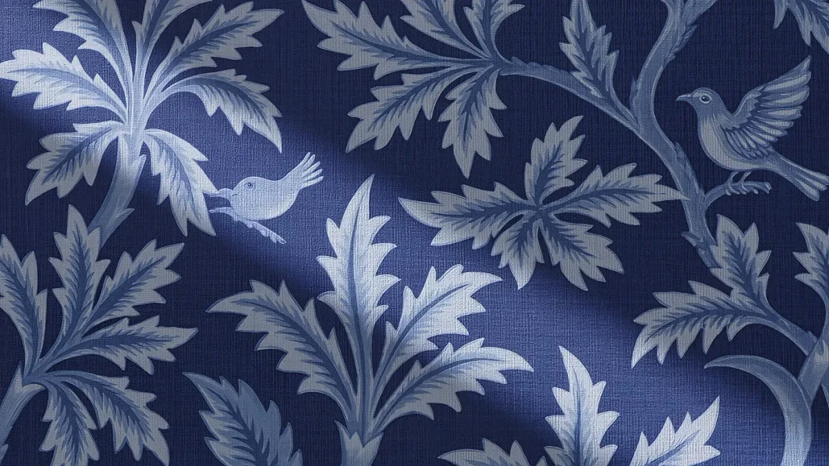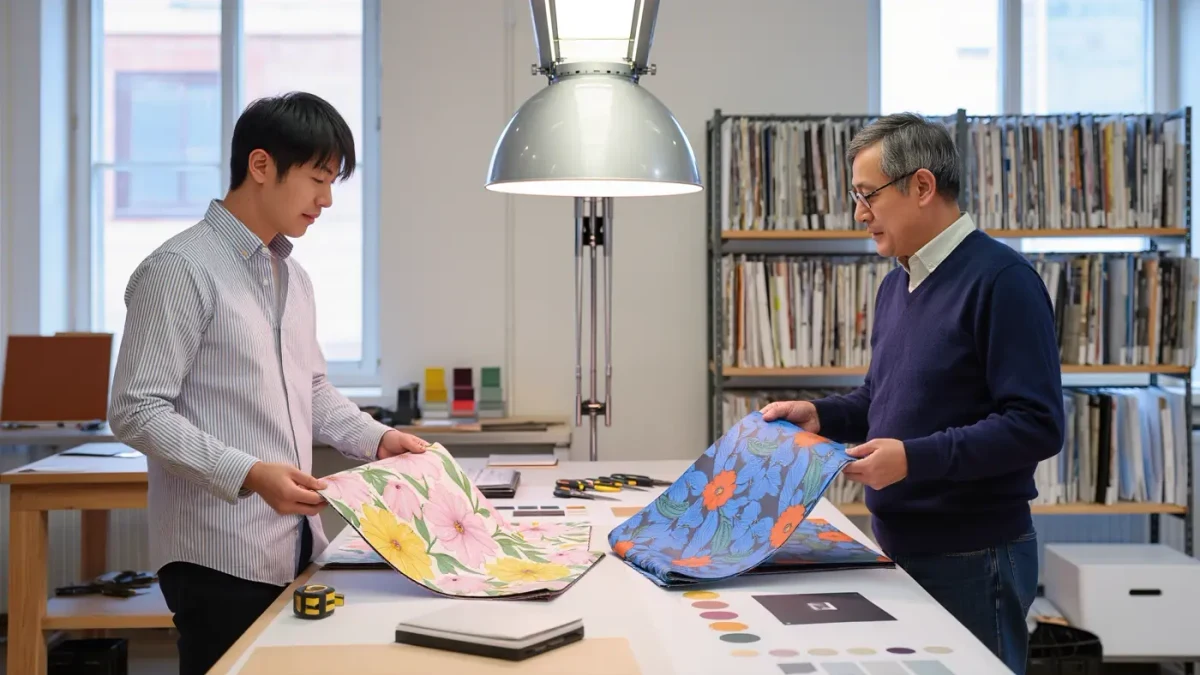
A colourway is a single pattern rendered in one specific palette: the same drawing of meadow flowers, printed once in indigo and cream, then again in ochre and moss. Surface designers rarely stop at one. A new pattern typically arrives with three to six sibling colourways, built as a deliberate family, because a drawing that took weeks deserves more than one life — and because buyers, from quilters to interior designers, rarely agree on colour.
What exactly is a colourway?
The word is industry shorthand for a colour variant of a fixed design. Change the drawing and you have a new pattern; change only the colours and you have a new colourway of the same pattern. Wallpaper ranges have shown the same print in several colourings for well over a century — a manufacturer's sample book from the Victorian era might offer one floral in crimson, olive and grey-blue versions side by side. The precedent is even older in printed cloth: the toiles of eighteenth-century Jouy were printed in single-colour monochrome versions — red, blue, purple or brown on cream — so one engraved copper roller could serve several tastes simply by changing the ink. The habit has never faded: nearly every wallpaper and fabric range released today carries its pattern in a small choir of palettes, and the swatch books that present them remain among the most thumbed objects in any pattern studio.
Why do studios build colourway families?
Economics and empathy in equal measure. A pattern ready for production is a finished asset: drawn, cleaned, separated and tested. Producing four colourways from one piece of artwork spreads that investment across four products, which is why licensing clients usually ask for recolouring options before they ask for new designs. Families also sell better together. A fabric range offered in a warm, a cool and a neutral colourway lets a quilt shop, a wallpaper stockist and an apparel brand all buy the same pattern for customers who would never choose each other's colours. And families travel through fashion's seasons more cheaply: when the trade moves on from terracotta to deep green, the drawing survives with only its palette refreshed.
How does a designer actually build a new colourway?
Methodically. In screen printing and most digital workflows, the pattern exists as a stack of flat colour separations — one layer per printed colour. Recolouring means reassigning each separation's colour while keeping the drawing untouched. The designer works from a reference palette, often pulled from trend forecasts, historical textiles or the studio's own archive, and checks three things at every step: that the darkest colour keeps its role as the anchor, that adjacent layers stay distinct, and that the overall balance of light, mid and dark matches the original. Then the family is proofed — printed or mocked up at full repeat — because a palette that sings as a swatch can turn leaden across three metres of cloth.
What can go wrong when recolouring a pattern?
Plenty, which is why recolouring is a craft rather than a button. The classic failure is contrast collapse: if two layers that were far apart in tone — a deep stem against a pale ground — are recoloured into similar values, the drawing dissolves and the pattern loses its legibility from across a room. Tone and colour are not the same thing, and tone must be preserved first. Other traps include palettes that look balanced under warm studio bulbs but grey under daylight, brights that overwhelm a delicate line, and grounds that fight the motif's undertone. Experienced designers recolour by value structure first, hue second, and they test under a neutral daylight source before believing anything. A useful discipline is to squint at the recoloured repeat until colour almost disappears: if the pattern's structure still holds in pure value, the colourway will survive whatever light it meets.
How do museums and archives fit in?
Historic collections are the colourway library. Museum textile stores hold the same print in multiple period colourings, dye recipe books and swatch cards, which is how designers study how earlier studios balanced families. Increasingly this material is digitised: the Smithsonian's open-access collections include thousands of printed textiles and wallpapers that can be compared palette by palette, an extraordinary free education in what makes colour groupings feel like a family rather than an accident.
How should a buyer choose between colourways?
Begin with the light the finished object will live in. North-facing rooms flatter warmer colourways and punish grey-toned ones; a bedroom's evening lamplight warms and darkens whatever is on the walls. Compare swatches at different times of day if possible, and always against the actual paint or furniture colours involved rather than in isolation. Then consider use: high-contrast colourways show beautiful pattern structure and every crease, while closer-valued families are quieter and more forgiving. There is no wrong answer within a well-built family — the designer has already done the work of making every sibling live together, so the choice can safely come down to affection.
Why do the best families feel designed rather than recoloured?
Because the strongest studios design the family, not the variant. They plan the first palette with its siblings already in mind — where the accent will travel, which layer becomes the hero in each version, how the family will look ranged together in a catalogue. A great set of colourways behaves like a portfolio of one designer's thinking: recognisably related, individually opinionated, and calculated so that somewhere in the range there is a version for someone who swore they disliked the pattern — until they met it in their own colours.