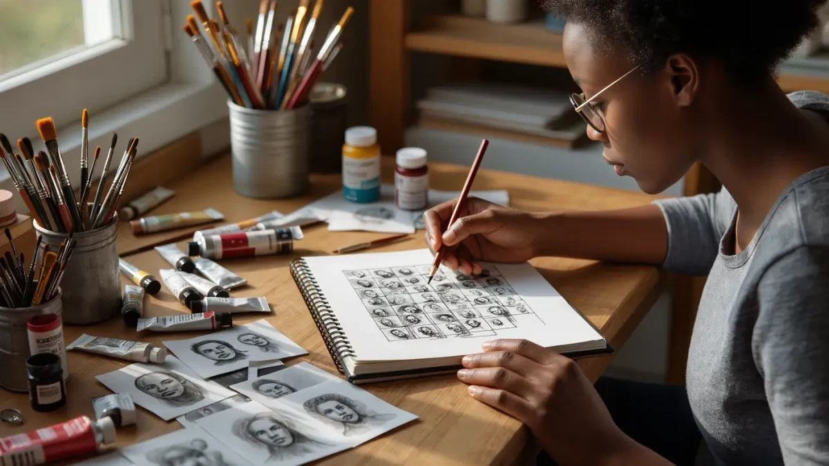
Character design decides whether a picture book works because a single drawn figure must stay recognisable, expressive and likeable across roughly thirty-two pages, in every pose and mood the story demands. Before any spread is painted, illustrators therefore build character sheets — pages of turnarounds, expressions and gestures that fix a hero's proportions the way a sculptor fixes an armature. Beatrix Potter was dressing her rabbit in a little blue jacket as early as the 1902 trade edition of The Tale of Peter Rabbit, and the discipline behind that decision has not changed since.
What makes a picture book character recognisable from any angle?
Young readers track characters by shape long before they notice detail. A design that works gives the figure a proportion signature — an unusual head-to-body ratio, a long neck, a heavy bottom — plus one or two repeating details such as a hat or a stripey sock, carried faithfully on every page. Consistent line weight helps the eye stitch the character together across spreads, and the design must survive both extremes of the book: tiny in a wide establishing shot and enormous in a close-up. Testing a character at both scales, from the front, the side and the back, is standard practice in studios that make picture books for the youngest audiences, because the test reliably exposes designs that only work in one flattering pose.
How do character sheets and model sheets keep a hero consistent?
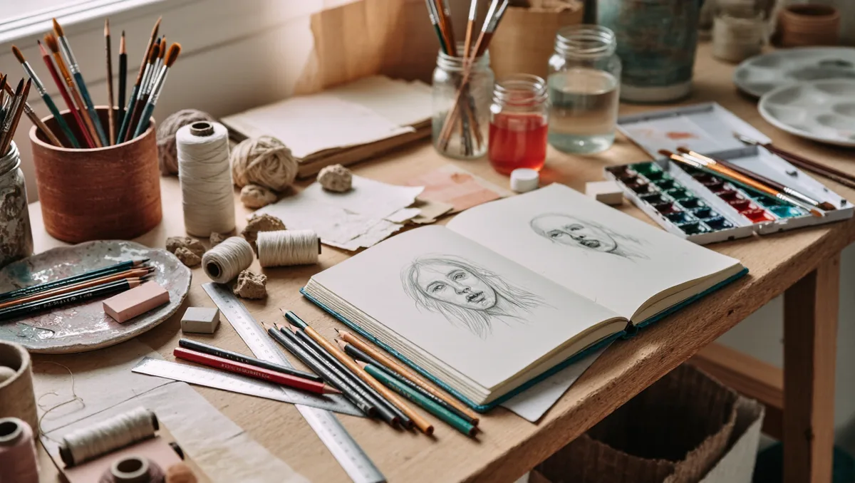
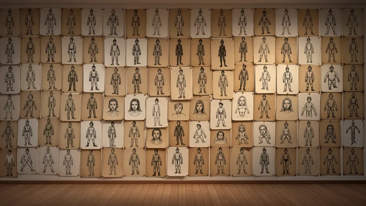
A character sheet gathers everything that must never drift: the turnaround, drawn front, three-quarter, side and back; an expression chart running from delight to despair; a gesture library of walks, reaches and slumps; and a scale chart that sets the hero beside the rest of the cast. Borrowed from the model sheets of animation studios, these references hang above the desk and are consulted for every spread. Consistency is not a bureaucratic nicety — children are strict continuity editors, and a collar that changes colour between spreads can break the spell of the whole book. Where a story has two leads, their sheets are drawn side by side so the silhouettes never blur into one another.
Why does the silhouette test matter so much?
The quickest audit of any character design is to fill the drawing with solid black and see what survives. If the black shape still reads as a rabbit, a dragon or a determined toddler, the design holds; if it collapses into a blob, the character depends on interior detail that will vanish at small scale or in the dim light of a bedtime reading. Strong silhouettes also carry action in crowded scenes, separating the hero from the market stalls, classroom crowds and forests that picture books love to fill. Many illustrators run the test at thumbnail stage precisely because it is unforgiving, cheap and impossible to argue with.
How does character design carry the story's emotion?
A face is the machinery of a picture book's feelings, and the design predetermines how much feeling it can express. Eye placement and size set the default mood; a brow line built into the basic construction gives anger and worry somewhere to live; posture decides whether a character can slump convincingly on the bad day. Good design builds in range, because a hero assembled only for mischief cannot grieve on the penultimate spread. Illustrators therefore test the extremes of the story — the biggest joy, the lowest low — on the character sheet before committing, adjusting the construction until the face and body can reach both ends of the emotional scale without changing character.
How do illustrators design characters to be drawn again and again?
Economy of line is a professional necessity. Over thirty-two pages the hero is redrawn dozens of times, so a design crowded with fiddly elements invites drift and fatigue. Working designers reduce a character to its load-bearing marks — the two lines that make the muzzle, the single curl that makes the fringe — and practise them until the figure can be drawn quickly and identically at any hour of a working day. Simple construction also leaves room for movement, since a character built from a few flexible shapes can twist, run and embrace without its identity wobbling, which is why the most beloved characters are so often the most simply built.
What do the classic characters teach about design?
Potter built her heroes on naturalist observation — real rabbits, sketched from life, then dressed with the smallest costume hints — which is why they stay believable however strange their adventures become. Quentin Blake works from the opposite pole, his speed and looseness generating an energy that precise drawing would strangle; he became the first Children's Laureate in 1999, recognition of a career spent illustrating Roald Dahl's stories among hundreds of others. Between those poles lie most working solutions, and students can compare a century of such decisions directly, because the digitised children's book collections at the Library of Congress place thousands of historical picture books within reach of anyone with a browser.
How is a character design tested with real readers?
Before a book is printed, dummies go out to the only critics whose verdicts matter. Illustrators and editors read aloud to children and watch rather than interrogate: where a finger points, the design is working; where attention drifts, either the drawing or the pacing needs another pass. The reaction to the character's first appearance matters most, since that spread signs a contract with the reader for all the pages that follow. A hero who charms on page one and keeps every promise made there is the quiet achievement of nearly all the character design that endures.