Hand-drawn illustrated maps are flourishing again because they do something satellite navigation cannot: they show how a place feels. The pictorial tradition runs from MacDonald Gill's decorative map of London commissioned for the Underground in 1914, through the cheerful resort and town maps of the 1920s and 1930s, and a fresh generation of artists is once again drawing streets by hand, landmarks enlarged, character first.
What can an illustrated map do that a satnav cannot?
A satnav answers one question — how do I get there — and answers it brilliantly. An illustrated map answers the questions around it: what is this place, what do its people love, where should I linger. A drawn map editorialises by design. The bakery gets equal billing with the cathedral, the harbour wall becomes a friendly curve, and the whole sheet carries a point of view no algorithm would risk. That is why visitors centres reach for a pictorial map when they want to communicate atmosphere rather than geometry, and why tourists frame them as souvenirs long after the holiday ends. The map stops being a tool and becomes a portrait.
Where did the pictorial map tradition come from?
Britain has two parallel cartographic inheritances. The Ordnance Survey, founded in 1791, perfected the precise national map, and its contours remain the standard against which every other kind of map is measured. The pictorial tradition went the other way. MacDonald Gill's 1914 decorative map of London for the Underground crammed the capital with jokes, landmarks and characters, and it proved so popular that illustrated maps became a staple of railway, resort and town promotion through the 1920s and 1930s, the great flowering of the genre. Postwar graphic modernism pushed the style aside for decades, but the pattern books survived in archives, attics and second-hand shops, waiting for a revival.
How do map artists balance truth and charm?
The craft lies in bending geography without breaking it. Street order, relative position and the coastline's honest shape are kept, because a map that misleads destroys its own usefulness. Scale, by contrast, is negotiable: the town's identity-bearing buildings grow slightly, the industrial estate shrinks politely, and open space breathes where the grid allows. Hand lettering does quiet organisational work, its sizes and weights ranking what matters. Colour carries atmosphere — harbour blues, market-town reds, moorland greens. The test every pictorial map must pass is whether a local can still navigate by it, and the best ones pass while making the familiar streets look newly loved.
Who commissions hand-drawn map illustrations?
The client list is broader than most people expect. Town trails and heritage projects commission maps to guide visitors past listed buildings and independent shops. Festivals need site plans that feel part of the event rather than municipal. Guidebook publishers, hotel groups, breweries, wedding stations and food producers all use illustrated maps to say something about provenance and place. Increasingly, individuals commission maps of a street, a farm or a family's patch of coastline as gifts, because a drawn map of a meaningful place is one of the few images people keep for decades. The commissions cluster wherever a place has a story worth telling at a glance.
What does drawing a map by hand involve?
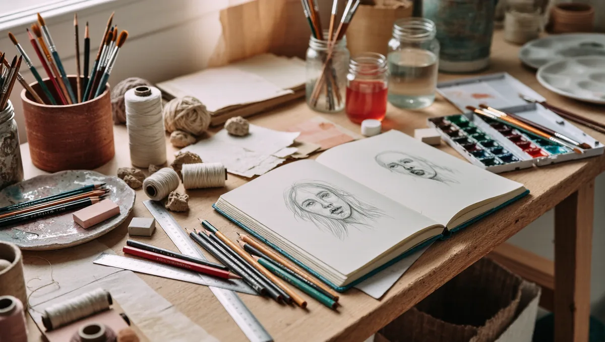
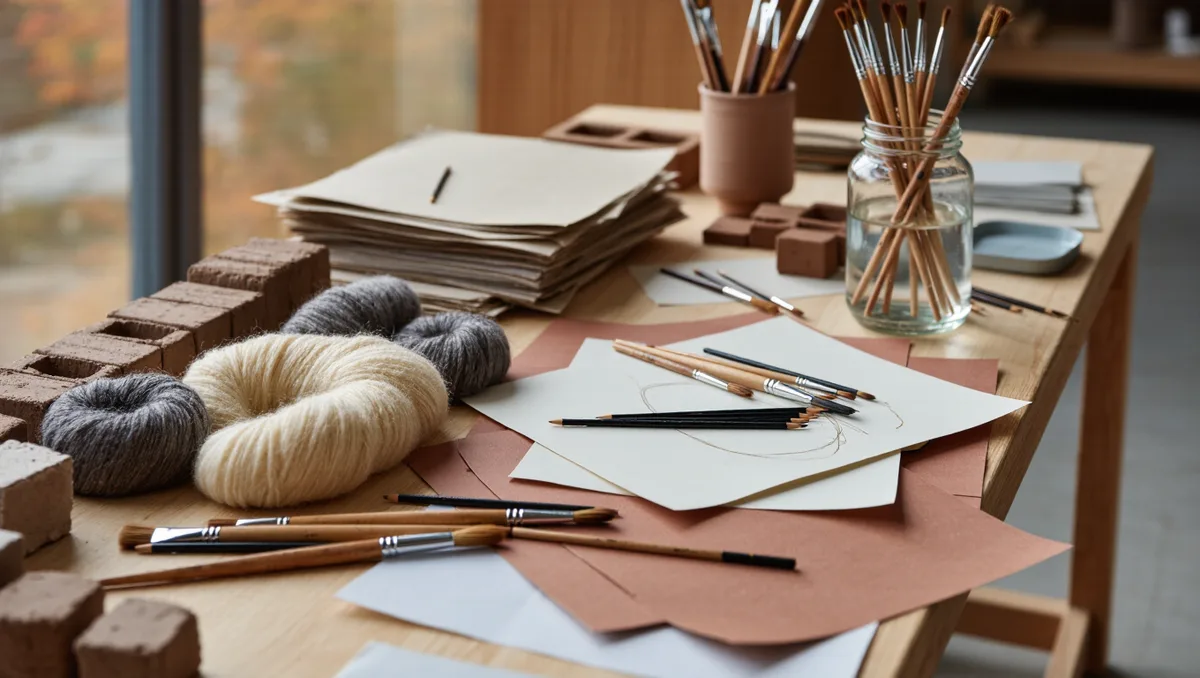
The romantic part — the drawing — is also the short part. A commissioned town map usually begins with walking the streets, sketchbook out, noting what locals point to and where the light falls. Back in the studio the artist traces a geometric base map for structural honesty, then rebuilds it by eye: blocking landmarks, setting the lettering, testing colour rhythms. Linework comes next, building by building, then the colouring, often in gouache, watercolour or a digital echo of their textures. Corrections arrive from the client's committee — a missing bakery, a contested boundary — and each change must be absorbed without disturbing the surrounding pattern. Weeks of quiet work later, the map goes to print and the town gets its portrait.
Why do drawn maps keep their appeal?
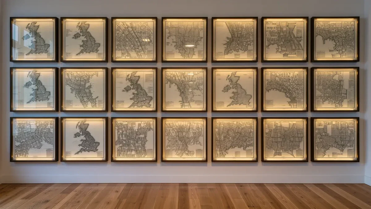
A hand-drawn map is a slow object in a fast medium, and its appeal grows precisely as navigation becomes automated. Feature writers have noticed the same current in the wider arts press, including essays at BBC Culture on the endurance of mapmaking as a visual craft. A drawn map declares that someone spent time with a place, and time is what the image communicates before any landmark is recognised. Framed on a gallery wall or a kitchen wall, it works as orientation, souvenir and affection all at once — a combination no other printed object quite manages. Unlike the satnav's calm voice, a drawn map invites detours, and its errors of affection — the pub drawn slightly too large, the hill made friendlier — are precisely why people keep them.
How do you commission or start drawing one yourself?
Commissioning well means giving the artist the briefs that matter: the area, the must-include landmarks, the mood and the format, then stepping back while the geography is worked out. Aspiring map artists learn the same way the professionals did — by drawing their own neighbourhood first, treating an accurate base map as scaffolding, and studying the mid-century pictorial masters held in transport and county archives. The entry requirements are modest: a pad, a pen, an Ordnance Survey sheet, and the patience to walk a place until its character organises itself on the page. Few drawing disciplines repay that patience more visibly.